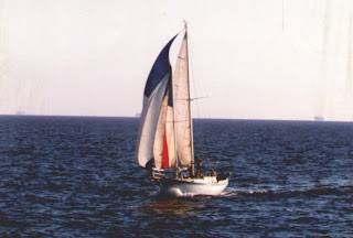
What's that you ask?
Have a look.
For a rough idea, look at the sidebar to the right.
Maybe down a bit.
I think, therefore, I blog, or rant. Or whatever the hell Descartes said.


 When we left, the engine had about 15 hours on it. When we got back it, the Hobbs showed about 52 hours. The trip back alone was 18 hours. According to the newly installed fuel gauge, we used a quarter tank of fuel or about 15 gallons. Or a little less than 1/2 gallon per hour. The trip back was a real bitch. I contacted a cold in Dago and we motored uphill into the wind for the entire 18 hours back.
  Oh well, wait until next year. Right now I have to decide whether I want to eat, drink or sleep.
 I think I'll take a nap. Right after I have a sandwich and a beer.